
![]() Well, here we are again! Can you believe it? Another year gone by and another conference to look forward to 😍 I’m going so I can once again provide the Personal Schedule templates for those of you who use them 😎 But first…
Well, here we are again! Can you believe it? Another year gone by and another conference to look forward to 😍 I’m going so I can once again provide the Personal Schedule templates for those of you who use them 😎 But first…
I’ve never mentioned it, but in previous “Personal Schedule” posts I’ve used images I created for Conference Logo contests years ago, all of which had to work for screen printing:


I never won, largely because our NJ Chapter is LOADed with inCREDibly talented illustrators whose work definitely surpasses mine, and though I tried, my renderings may not have met the judges’ criteria in some unexpected way. BUT — with the work having been done, the logos came in handy for these blog posts which was great ’cause I didn’t have to find images and they weren’t wasted 😄 (I hate waste 🤨).
Anyway, back then I decided to no longer waste my time and energy entering art-related contests. That was — until this year. Yep, our NJ Chapter wanted to update our logo and the prizes dangled like sweet pieces of Swiss chocolate pushing me to take another stab at it even though I knew the chances were slim, especially since this was for a new NJ Chapter logo, not just for this year’s conference. All the prize elements were enticing, but the biggest one for me was the chance to get conference registration FREE! 🤑
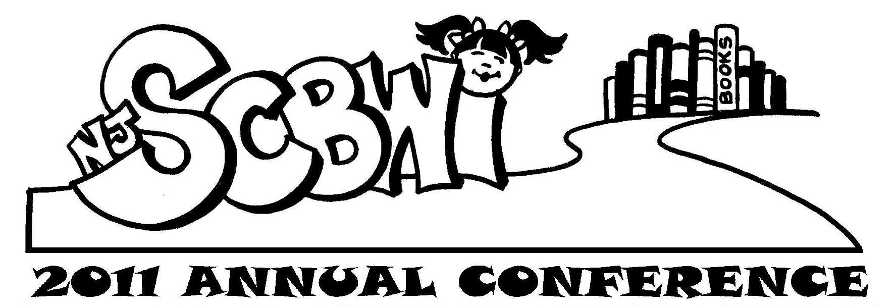
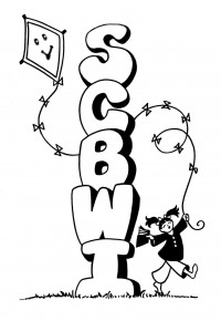
Our logo for the past 6 years: Our logo prior to that:

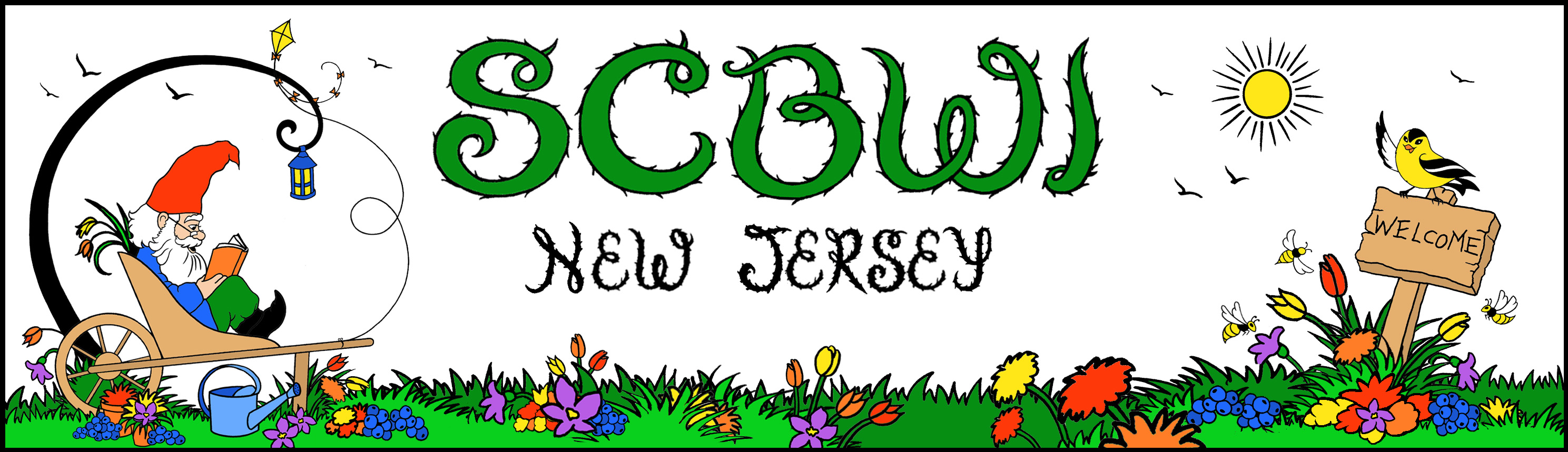
Long story short—I didn’t win. I did my best to follow the “clever, simple, NJ-related, easy-to-read/use across social media, must incorporate kite” guidelines. It was also suggested we check out what other Chapters did to represent their states, but I kept questioning “how simple?” Though I had the feeling they wanted super simple, I was still compelled to render a “Garden State / childlike fantasy” take on things with my bibliophilic garden gnome, wanting to stay true to KidLit 📚. I even went so far as to create a header for social media which incorporates the state bird (oriole), state insect (bee), and state flower (violet):
From the comments the judge made about the winning logo my guess is she wanted ![]() much simpler, more clever, and perhaps “business”-like, maybe in line with the simplicity of the SCBWI National “kite” logo. (I’m actually a big fan of simple logos, Toyota Infiniti being one of my favorites; I think it’s brilliant!) We’ll all find out when the winning logo is unveiled at the conference in a few days — and I’m SO curious! 🔎
much simpler, more clever, and perhaps “business”-like, maybe in line with the simplicity of the SCBWI National “kite” logo. (I’m actually a big fan of simple logos, Toyota Infiniti being one of my favorites; I think it’s brilliant!) We’ll all find out when the winning logo is unveiled at the conference in a few days — and I’m SO curious! 🔎
It was suggested that the 51 non-winning entrants display our logos in our portfolios at the conference, and I’m really excited to see them! I don’t know about you, but I’m always so fascinated, when many artists are given the same subject matter, how wide the scope of imagination can be. Since I don’t display a portfolio, I again figured not to waste the work and share it here instead. Though it won’t represent the NJ Chapter, it does represent me 😊. I hope you like it ’cause you’ll be seeing it again—probably every year! 😉 😀
OK, so now down to business—the reason you’re here! You want your 2019 June New Jersey SCBWI Conference to go as smoothly as possible and you find my template a useful tool (which makes me SO happy🤗 👍). I know I can’t do without mine! 😮. (Note: registration is closed.) For you newbies, here’s some helpful background info so you can understand why I do this and what qualifies me to do so.
With that said, I’m pleased to present this year’s versions for you, with yet another “Betty BOGUS” example to help guide you:
And I will reiterate this each year:
What I’ve done is made a variety of versions to suit whatever are your preference and needs. There is a Black/White/Gray version and a Color version. They are both available here as either a workable Word document or a PDF (links at end of post).
- With the WORD docs, you can type and manipulate anything in it. Just click your cursor in any cell (box) you want to type in. If you are familiar with using tables in Microsoft Word, you know that if you are in the table, the “Design” tab appears from which you have many options to change colors, fonts and anything else you choose.
- With the PDF you can’t manipulate the document itself other than filling in and marking by hand.
- Your choice of B&W or COLOR is determined by whether or not you want to print in black ink only or full color. Either way, you can color code things to your liking using colored pens, markers and highlighters should you prefer.
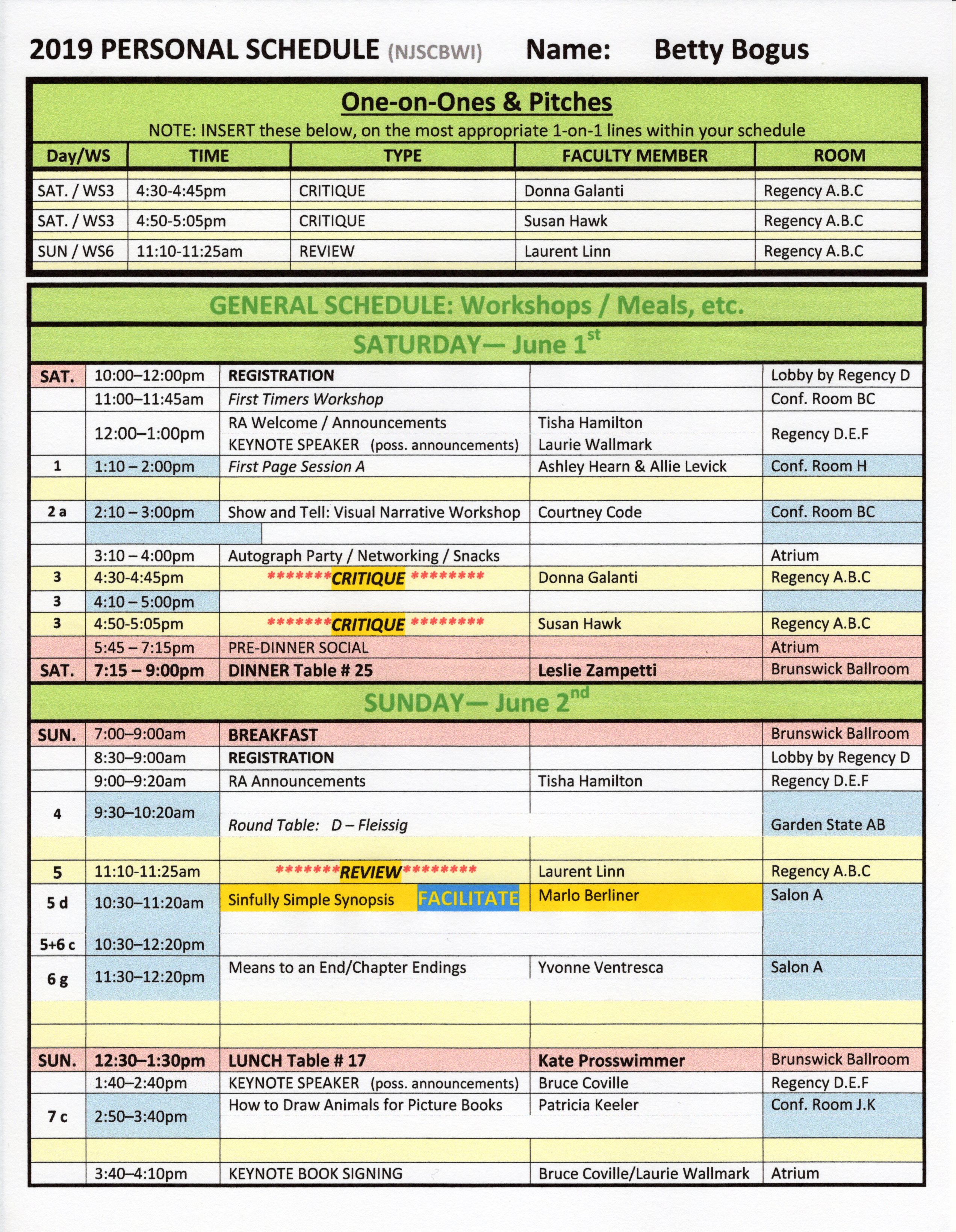
To serve as reference on how to fill in your own personal information, below I show Betty BOGUS’s bogus personal schedule based on this year’s program (meal table #s are NOT real). “Betty” filled in her personal info on the computer in the Word document, including color, but as I said, you can fill in the document by hand and use highlighters, etc. to color code if you prefer. Also make note of the blank lines and deleted details. Those template details don’t pertain to Ms. Bogus’s schedule, so by deleting all unnecessary elements the schedule is less cluttered and more readable. If you are filling the form by hand, you can simply cross out or white out the unnecessary lines and information.
As shown here, I’ve designated meals in pink, workshops marked by blue/white lines; the blue/yellow box indicates the workshop Betty volunteered to FACILITATE. You’ll notice the CRITIQUEs are highlighted in bright yellow to stand out. (On mine I also mark things like “Check In,” “Check Out”, “Eat,” etc.) Typically the week prior to the conference we receive our volunteer assignments and rooms are assigned to the workshops and activities. That’s when I can finalize these templates and you’re able to fill in your personal info, print it out and you’re good to go 😀 .
FOR DOWNLOAD:
NJ SCBWI 2019 CONFERENCE PERSONAL SCHEDULE TEMPLATES
B&W Word doc: COLOR Word doc: B&W pdf: COLOR pdf:


So there you have it! I hope you’ve all done your research and have everything in order. You’ll be fully prepped, with schedule in hand, to have a BLAST with kindred spirit KidLit-ters. And PLEASE be sure to share this with anyone you know who’s attending our amazing NJ SCBWI Conference and may be interested.
Can’t wait and hope to see you there! 😀 Safe travels, everyone!

I love your banner!!! I think it may be time for another round of fairy and gnome books once we’ve finished the narwhal/unicorn/blobfish period.
LikeLiked by 1 person
Ha! Lauri, thank you for commenting 😀 And thanks! It was a lot of work, but I loved the subject matter 🙂 There’s something about gnomes, right? 😀
LikeLike
btw, did you click on the image to see it enlarged? You can really see the details that way 🙂
LikeLike
Looking forward to your photos!
LikeLiked by 1 person
Ah, no photos, Ste J! The conferences are always a hustle-bustle event, and I’m always too busy networking, talking and getting from place to place, it’s a whirlwind and I almost never even think of taking photos 😉 Of course, lots of other people do and you can see them on Twitter (and elsewhere, I’m sure) at #NJSCBWI2019 😀 So glad you stopped by! I hope to be by some time soon…likely once all submissions are done 😀
LikeLike
I will certainly have a gander! Stop by anytime, its always good to see you and catch up. No pressure though.
LikeLiked by 1 person
I think your banner is top-notch! xo
LikeLiked by 1 person
Thanks so much, Pamela 😀 I have to say, though, after the conference I was most blown away by the work by Guy T. Olivieri! He described all the little “hidden” symbolism for New Jersey and writing. Really examine everything with the letters, the plane, just everything. Phenomenal! I wish it had won Here’s the page: http://privateerart.com/Privateer_Art/SCBWI_logo.html
LikeLiked by 1 person
Well done! Hard to believe it didn’t win! ;-0
LikeLiked by 1 person
I know!
LikeLiked by 1 person